Visual identity
IBA Company.
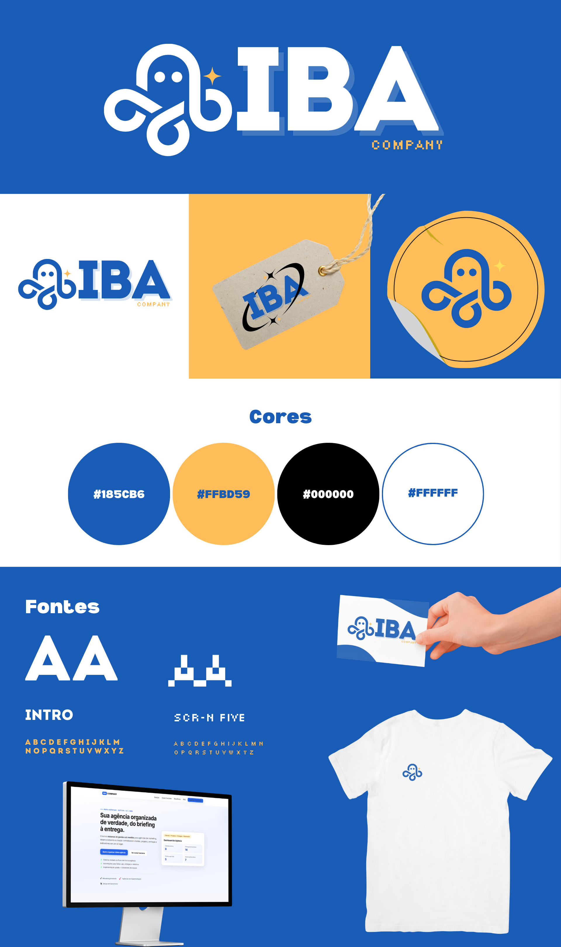
IBA's visual identity: logo, palette, typography and the rules that keep the brand the same everywhere.
Why I made it
IBA started as my brand and gradually became my technology studio. Before it had a website, a game or a sales proposal, it needed a consistent look. Without that, every new piece would come out differently.
The idea
A technology brand that conveys trust without feeling cold. Corporate blue is the base, neutral tones give breathing room and vibrant accents appear sparingly, only to draw attention where it matters.
For typography I chose Outfit for headings, which is geometric and friendly, and Inter for body text, which is designed to read well on screen.
Creative process
I designed the logo with every place it would appear in mind: light backgrounds, dark backgrounds, small sizes on phones, stationery. That is why the manual has versions for each background, minimum clear space around the logo and a list of incorrect uses to avoid.
The brand book documents all of this. It is what makes sure the website, social media and IBA Games speak the same visual language.
Decisions I made
- Blue as the baseIt conveys trust and fits the world of technology without being aggressive.
- Outfit + InterOne brings personality to the headings, the other makes the body text comfortable to read.
- Usage rulesMinimum spacing and incorrect uses written down, so the brand does not depend on me to be applied correctly.
What I took away
A visual identity is a system, not a logo. The real work lies in the rules that keep the brand recognizable when someone else applies it.