Personal brand
Isis Alencastro.
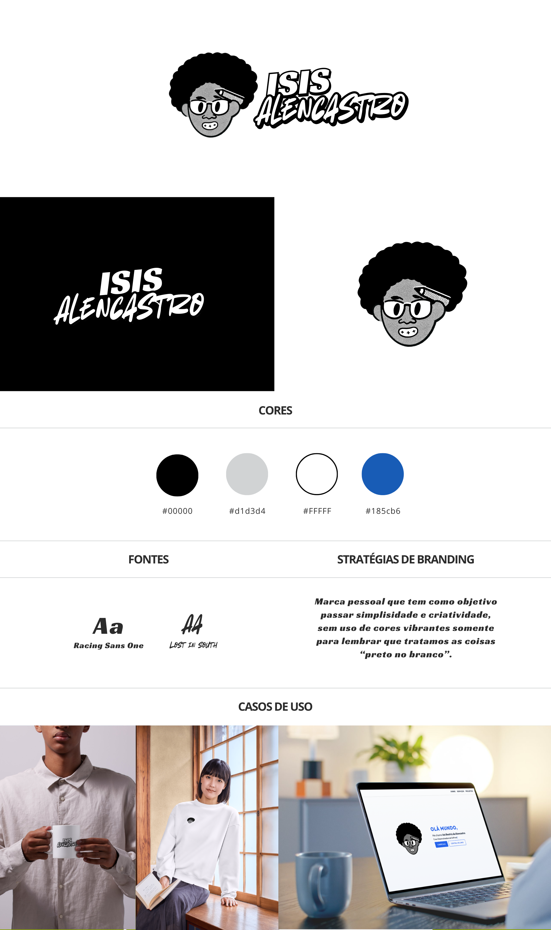
My personal brand: black, white, gray and a touch of blue, as a reminder that I keep things black and white.
Why I made it
I create content and have a portfolio, a resume and a studio. I needed an identity of my own, separate from IBA but in conversation with it.
The idea
Simplicity and creativity. I chose not to use vibrant colors on purpose: the palette is black (#000000), gray (#D1D3D4) and white (#FFFFFF), as a reminder that I keep things black and white, with clarity and no beating around the bush.
The only splash of color is the blue #185CB6, the same as IBA's. It is the thread that connects my personal brand to my studio.
Creative process
Typography is where the personality comes in: Racing Sans One, with a sense of motion and speed, and Lost in South, a handwritten typeface that brings the human side. One fast font and one handwritten font, which is a bit of who I am.
I tested the brand on real applications from the start: a mug, a T-shirt and the web portfolio itself. If it didn't work on a mug, it wouldn't work anywhere.
Decisions I made
- Black and whiteA neutral palette as positioning, not just aesthetics.
- Shared blue#185CB6 connects the personal brand with IBA.
- Typographic contrastA bold display font paired with a handwritten one, to balance the technical and the personal.
What I took away
Creating your own brand is harder than creating a client's, because there is no brief to blame. I had to answer honestly how I wanted to be remembered.