Visual identity
Aria Agency.
A visual identity created for Aria: logo, color system, typography and the brand's usage manual.
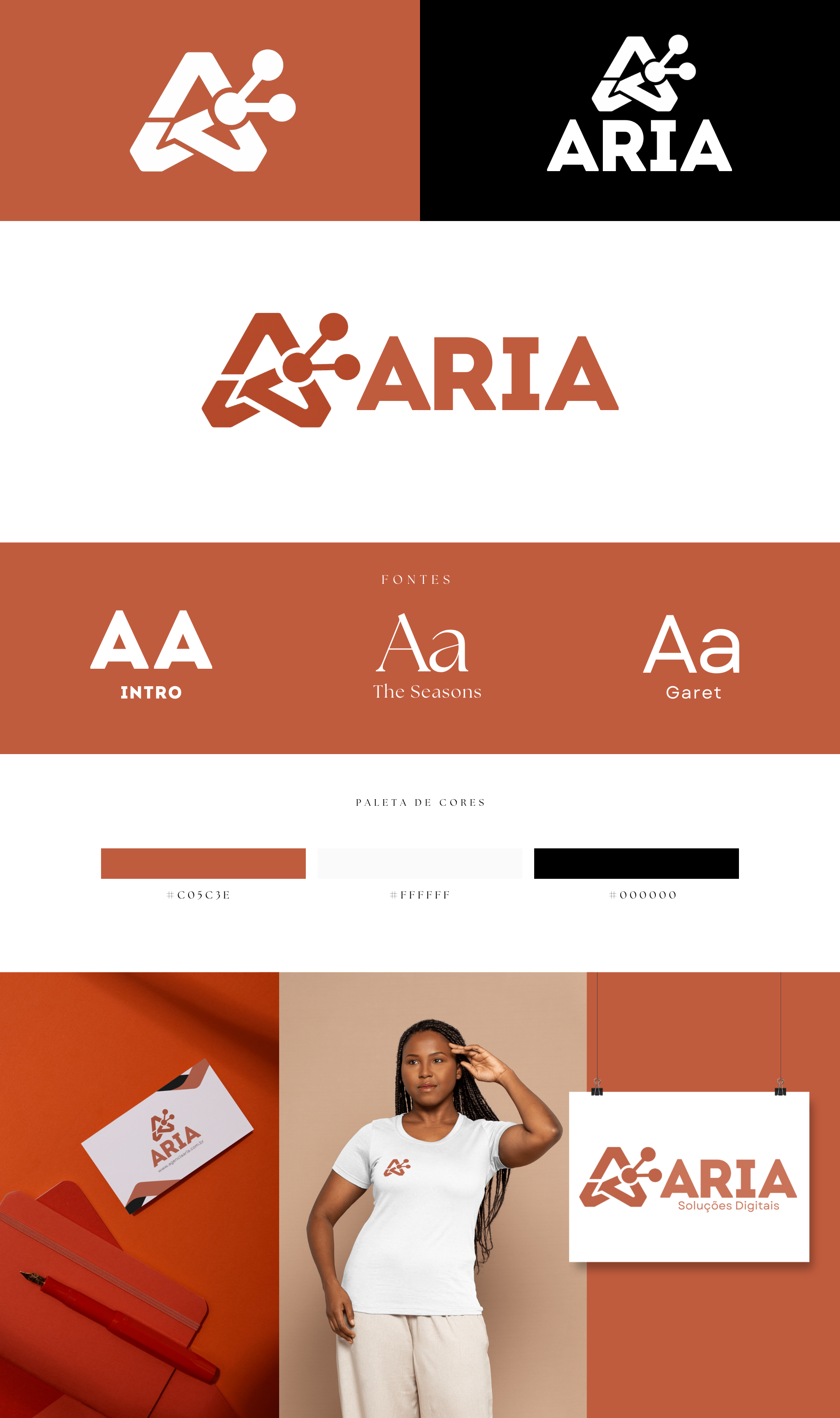
Why I made it
Aria needed an identity that stayed consistent across every channel: digital, print and social media. A brand that changes its look with every post loses strength, and the goal was to avoid that from the start.
The idea
Create more than a logo: a complete system, with defined colors, a typographic hierarchy and usage rules, so anyone on the team could produce a piece without straying from the brand.
Creative process
I started by understanding what Aria wanted to convey and to whom. From there I defined the logo, the color system and the typographic hierarchy, and tested everything on real applications: screens, print and posts.
In the end, it all became a brand book that documents the visual guidelines. It is the document that stays with the brand after I am no longer on the project.
Decisions I made
- A system, not just a logoColors, typography and rules designed together.
- Complete typographic hierarchyHeading, subheading and body defined for each format.
- Usage manualWritten guidelines to ensure consistency across the brand's channels.
What I took away
Working on someone else's brand is an exercise in listening. My taste matters less than what the brand needs to communicate.